Learning from the past is one of the best ways to avoid making pivotal mistakes while setting yourself up on a path for success. By taking a look at some rebranding fails that really stick out, we can learn a lot about how to approach a rebrand strategically and which tactics work (and don’t) historically.
Just this year alone we’ve witnessed a couple of headline rebrands that made major waves, including Twitter’s transition to X under Elon Musk’s leadership and HBO’s streaming service moving from HBO Max to simply Max.
Only time will tell if rebranding these household names will pay off down the line or not. In the meantime, we’re going to take a closer look at the immediate reactions to these rebrands, alongside a few other branding faux pas through history, to see what lessons we can learn from rebranding fails and what major rebranding mistakes companies need to avoid.
Branding and marketing often work in concert with one another to create and deliver captivating and memorable moments. Bring your marketing to the next level with the tips and strategies found in Impact’s Attract, Engage, Stand Out – Building Effective Marketing Campaigns webinar.
Jaguar’s Brave New Branding
The renowned car company known worldwide as Jaguar dates back to the early 1920’s and saw the first car of that brand produced a bit over a decade later in 1935. Fast-forward through nearly a century of automotive innovations, rapid technological advancements, and massive shifts in consumer behaviors, the company is undertaking a major rebrand.
With the onset of electronic vehicles as a standard, and often preferable, option for consumers, Jaguar is attempting to pay homage to a guiding philosophy established by their founder, Copy Nothing, as they transition into a full line of electric vehicles.
This sentiment is certainly embodied in the car companies recent rebranding defined by a term Jaguar’s coined, Exuberant Modernism that is supposed to be a celebration of artistry. The rebrand features the removal of the iconic jaguar imagery and replaces it with a pair of inverted J’s mirroring each other.
While the goal of the rebrand is to step into the future with a new look and feel for a new generation of consumers, the transition has been polarizing to say the least. Many consumers, especially loyal brand enthusiasts, see this as a mistake that will plummet the reputation and recognition of the Jaguar brand.
On the other hand, this could be the type of move that connects a newer, younger demographic with a well-respected legacy brand, stepping into a new light and a new era.
While it’s still a little too early to tell if this is a total rebrand fail, this move is definitely one worth watching as it continues to unfold.
The Key Takeaways
As Jaguar undergoes a transformative rebrand, the company aims to redefine itself for the electric vehicle era while honoring its nearly century-old legacy. This ambitious shift centers on a bold new aesthetic and a departure from iconic symbols, sparking debate about its impact on brand identity and consumer loyalty.
Legacy and Transformation: Jaguar, a brand with roots in the 1920s, is rebranding to align with its transition to an all-electric vehicle lineup, embracing its founder's philosophy, "Copy Nothing."
New Branding Philosophy: Dubbed "Exuberant Modernism," the rebrand emphasizes artistry, replacing the iconic jaguar imagery with mirrored "J" shapes, signaling a bold departure from its traditional visual identity.
Mixed Reactions: While aimed at attracting younger, design-focused consumers, the rebrand has polarized opinions. Loyalists fear it dilutes the brand's heritage, while others see potential in redefining Jaguar for a new era.
Future Implications: The rebrands success or failure remains uncertain but represents a pivotal moment as Jaguar reinvents itself for modern audiences and a changing market.
The Gap Rebrand
One of the most infamous rebrands gone wrong in recent history comes to us just over a decade ago in the wake of the 2008 economic crisis. Gap, a brand founded in 1969 with global acclaim and widespread popularity, decided in 2010 to lean into a rebrand.
Before the 2010 rebrand, Gap’s logo was established in 1990, so it had been around for a couple of decades. Consumers knew the Gap brand by its large lettering and navy-blue background, and this familiarity gave them some emotional loyalty to the original branding.
Gap unveiled its new branding on October 6th, 2010 and received so much immediate backlash from the marketplace that they reverted to their 1990 branding only 6 days later on October 12th.
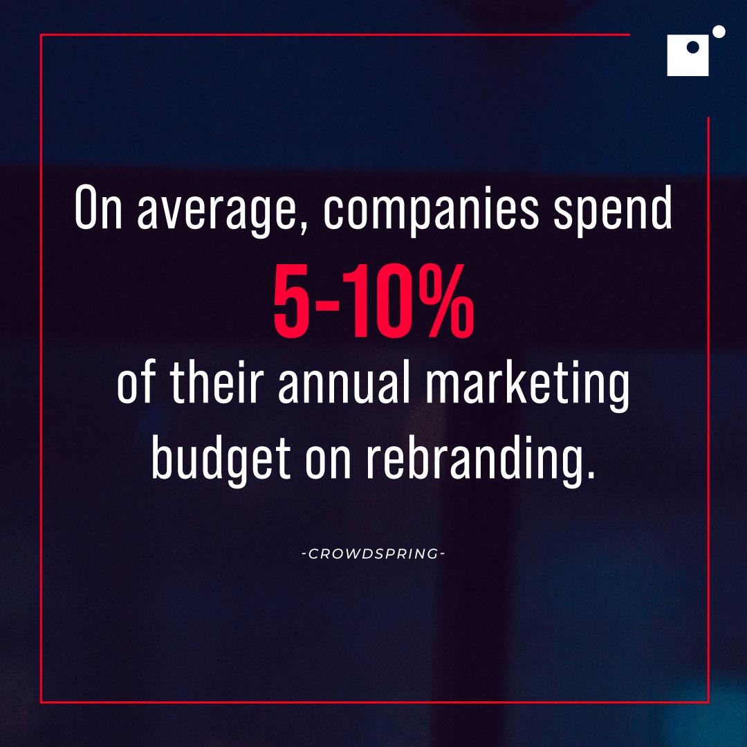
This whole redesign is estimated to have cost Gap around $100 million, which is a pretty penny to pay for a rebrand that didn’t even last a week and far outpaces the average annual budget for rebranding, which comes in at 5-10%. Not only that, but in the same time span Gap’s reputation took a massive hit, as consumers openly mocked the new logo with spoof “make your own gap logo” websites.
The Key Takeaways
There are a few lessons to learn from the Gap rebrand fail. First and foremost being how valuable brand recognition is. The 1990 Gap logo had worldwide consumer recognition, trust, and loyalty. When the 2010 redesign rolled out, however, consumers were confused and thrown off.
The best rebrands happen with a bit of build-up. In other words, consumers don’t wake up one morning with an entirely new brand dropped on their head. Rather, good rebrands are announced well in advance, giving consumers plenty of time to adapt to the inevitable new face of a brand they once loved.
Finally, the Gap rebrand demonstrates the importance of an intentional and purposeful rebrand. The 2010 Gap redesign wasn’t accompanied by any changes or modifications to their product lines, which left consumers feeling even more confused about the decision.
A strong rebrand is intentional, marks a new chapter in a company's life, and is announced well ahead of launch.
Tropicana Has Problems With Packaging
Gap wasn’t the only company looking for refreshed imaging in the years after the 2008 crisis. Tropicana, owned by PepsiCo, also took a shot at some new branding in early 2009. The focal point of the Tropicana rebrand was in bringing a new image to their packaging.
Working with the agency Arnell, which closed its doors in 2013, Tropicana invested $35 million in an advertising campaign that would work to promote their new-look packaging. Then on January 8th, 2009, Tropicana launched its new packaging initiative.
Tropicana’s initial packaging featured an orange with a straw sticking out of it, a classic orange top, and a line of copy reading “NO PULP” which was an important and distinctive mark for consumers.
The new packaging featured a lot more white space and a glass of orange juice that was split between the front panel and side panel of the carton, visible in full only at a 45-degree angle. The new packaging also featured an orange-like screw top and omitted the no pulp disclaimer.
In just two months' time, sales dropped 20% from an annual $700 million, accounting for around $30 million in lost sales over that span. As such, it was on February 23rd, 2009 that Tropicana announced it would be rolling back the new packaging in favor of its original form.
All-in-all, between the $35 million invested in the ad campaign, and the $30 million in lost sales after launching the new packaging, this rebranding failure cost Tropicana well over $60 million.
The Key Takeaways
Tropicana made some major mistakes in their 2009 rebrand that only lasted a pair of months. Similar to the Gap rebrand, Tropicana underestimated the loyalty and emotional tie that consumers felt toward the original logo and design.
The orange with the straw on the carton is iconic and consumers immediately recognized the product when they saw it on the shelf. Not to mention, the “no pulp” disclaimer was a big indication for consumers who were specifically looking for a no pulp orange juice.
Maybe the worst of it all, though, was the design of the new carton splitting the image of the glass of OJ between the front panel and side panel. The design works on an angle, but cartons of juice are seldom stocked at an angle in the supermarket, and the design isn’t nearly as eye-grabbing when only viewed in part.
After just two months, the new packaging was pulled from the shelves of stores all over North America as Tropicana returned to its original branding.
This once again shows the value of consumer recognition and loyalty and pins it against the backdrop of iconic packaging. Because Tropicana’s original branding was so recognizable, they would have been better served by making incremental changes to the packaging.
From Twitter to X
Twitter, once a household social media platform that rose to the height of challenging Meta’s Facebook, has now undergone one of the most significant brand upheavals in recent history. Ever since Elon Musk purchased the platform previously known as Twitter, the rebranding began.
Replacing the iconic blue bird, named after Larry Bird and a logo appropriate for ”tweeting,” Elon Musk has instead opted to (once again) try and make his fantasy company, X. In 2000, Musk tried to rebrand PayPal to X.com which gained almost no traction and ultimately fizzled out.
Now, fast forward 20 years, and Musk is once again relentlessly pursuing an “everything app” by rebranding Twitter to X. Unfortunately, the rebrand isn’t taking with users.
In fact, two different polls conducted by Forrester and YouGov reported negative reactions around the rebrand from 43% and 67% of Twitter, or X, users respectively.
Another issue with the X branding is that it’s incredibly difficult to protect on a legal level, and doesn’t offer much in the way of distinction. This is showcased by the stark drop in the app’s ranking and overall download volume.
“[Eric] Seufert looked at Twitter/ X's ranking on the Apple App Store's "Top Downloaded" chart from Jul. 27 to Aug. 15 and found that the app's average ranking fell significantly after the rebranding, from 35 to 54.”
Plummeting from position 35 to 54 is certainly indicative of the struggle Musk is facing in his attempt to rebrand Twitter to X.
The Key Takeaways
The takeaways from Musk’s fractured attempt at rebranding Twitter to X revolve around the iconic logo that the blue bird once was, the ambiguity of the name change, and the seemingly disconnected direction Musk is pushing the social media platform.
While every brand considers a little facelift from time to time, the Twitter rebrand feels inorganic and forced.
By getting rid of the blue bird logo that everyone recognized instantly, Musk effectively scrapped one of the most valuable assets the brand had within a matter of weeks after taking over. It wasn’t just the blue bird that had worldwide recognition, either. Tweeting was even added to the official Merriam Webster dictionary.
Additionally, by rebranding to X, the application ran into issues even being listed on the Apple App Store which requires applications to have names that are at least two characters.
Bloomberg estimates that Musk’s discombobulated rebrand has cost the social media platform somewhere between $4 and $20 billion so far.
Recapping Rebranding Fails and the Lessons to Learn
Rebranding is an important process for companies who want to stay modern, competitive, and adaptable enough to pivot when necessary. However, rebranding needs to be approached strategically, intentionally, and should feel somewhat like an organic evolution for the brand.
In the examples above, we examine how important the timing of a rebrand is, why it’s so critical to consider consumer perspectives before launching a rebrand, and how the worst rebrands stem from needless meddling rather than true pivots.
Taking these lessons to heart can help your organization make strategic changes and set you up for successful rebrands in the future when necessary.