Why Mobile User Experience (UX) Is Essential to Growing Your Business
Are you emphasizing responsive web design when developing the strategy around your online user experience? Learn how to deliver a top-tier experience to your audience regardless of the device they use.
Blog Post
8 minute read
Jan 22, 2026
Have you been on the move when it suddenly dawns on you that you need to pay a bill? Nowhere near your laptop, you pull out your smartphone, open your browser of choice, and head to the company's website feeling so thankful for the modern day and the convenience of technology – that is until the site actually loads, and you realize it’ll be easier to pay the late fee than deal with the mobile experience.
With the average consumer spending over 4 hours a day on their phone, it becomes the businesses’ responsibility to provide an easy, intuitive, and user-friendly experience for their consumers regardless of the device they’re using. Tailoring a high-quality mobile user experience all starts with mobile-first and mobile-responsive design.
Creating a strong user experience through responsive web design isn’t just about meeting your audience where they are, either, it’s a way to keep users on your site instead of having them bounce to a competitor offering a better experience, acts as a testament to evolving with the times, and builds both consumer trust and loyalty.
A few of the mobile-first design best practices include:
With so many people choosing to browse almost exclusively on their phones, businesses now need to enter their web design strategies with a mobile-first mentality. This means designing from the get-go with mobile in mind and considering the mobile user experience throughout all of the stages.
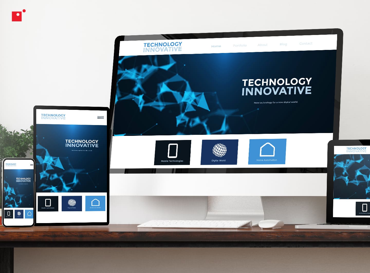
To put it more formally, responsive web design is an approach that prioritizes creating an optimal experience for all devices, regardless of screen size. This strategy ensures that essential features work well on smaller screens, providing a strong foundation that can scale up for tablets and desktops, enhancing usability across all devices.
Here are some things to keep in mind when designing websites, and a few more ways that designing with mobile in mind can result in amazing and innovative experiences.
Responsive Web Design Best Practices
To help build a mobile site that’s engaging, easy to navigate, and provides a positive experience for all visitors, you can generally follow simple UX best practices when designing.
Join us below to take a closer look at six of the pillar principles to keep in mind when designing for the omni-device experience.
1. Build Simpler Navigation
Mobile sites must be simple for visitors to use because of the limitations that come from mobile devices. Smaller screens mean that you have significantly less space than on a desktop and touchscreen navigation changes how people interact with your buttons and menus.
You need to design site navigation that is intuitive while matching these limitations. If you don’t, you’ll create a frustrating experience that’s difficult to understand and which causes visitors to leave your site. And lost users mean lost dollars.
2. Reduce Clutter and Chaos
One of the goals of building a simpler site for mobile is to reduce the clutter and chaos that you can get away with on the desktop version. This might mean removing images, infographics, features, functions, videos, animations, and anything else that’s not necessary for the site to serve its purpose.
This is very much a case-by-case basis, and you can best decide what to include and eliminate but, generally, you’ll want to reduce the on-screen clutter as much as possible in order to emphasize what’s important.
As smartphones get smarter and mobile design practices evolve, the ability to integrate interesting visuals, interactives, videos, and other graphic formats will get easier, but designers still need to think about screen size and ensure users are seeing the most important and relevant material to their journey.
3. Prioritize What You Want People to See
Another way to improve the mobile user experience is through prioritizing the content you want users to see and interact with once on your site or app.
By focusing on the most critical content first, businesses ensure that users see what matters most—whether that’s key information, calls-to-action, or engaging visuals—without needing to scroll endlessly. Clear content hierarchy guides users’ attention, helping them quickly find what they’re looking for, which reduces frustration and keeps them engaged with the app or site.
In addition, prioritizing content helps with load times and functionality. Mobile users often face data limitations and may have weaker internet connections, especially when on the go. Lightweight, prioritized content reduces the amount of data being loaded, ensuring faster, more reliable access to essential information.
This careful curation is crucial in keeping users interested; studies show that even a few seconds of delay can lead to higher bounce rates. By delivering the right content in the right order, mobile-first designs not only improve user satisfaction but also increase conversions and retention, directly benefiting the business.
4. Design for People
Consider the physical limitations of your user on their phone. To comfortably scroll and navigate your site, you need to design the core elements to be easily used within the average reach of a hand holding a phone.
Keep this in mind when designing your navigation elements so you don’t put key buttons out of reach or force your user to constantly reach up or down on the page, having to adjust the way they hold their phone and irritating them on the way.
5. Design with Familiarity
On mobile, you have a lot less space to get your point across. This typically means resorting to icons or short phrases (usually just one or two words) to help people understand the intention of a button or link or menu.
Don’t try and get cute or unique, stick to what works and what people will naturally understand. Use a standard hamburger menu icon, a cog for settings, bookmark shape for saved posts, and words like locations, contact us, or blog for these pages.
Using familiarity in mobile design is crucial for creating an intuitive user experience, as it leverages users’ existing knowledge of common design elements. When users encounter familiar icons, gestures, and navigation patterns, they can quickly and easily navigate an app or mobile site without needing extensive guidance.
Prioritizing familiar elements ensures that users feel confident and efficient in their interactions, which boosts satisfaction, retention, and overall user loyalty, directly supporting business goals.
6. Readability and Accessibility
Readability and accessibility are fundamental to effective mobile design, as they ensure that content is easy for all users to read, understand, and interact with, regardless of device or ability.
Mobile screens are small, and users often view them in varied lighting conditions, so clear, readable text is essential. Choosing legible fonts, setting appropriate text sizes, and ensuring adequate contrast between text and background enhance readability, allowing users to quickly absorb information without straining their eyes.
Effective readability doesn’t just improve user experience—it keeps people engaged, reduces bounce rates, and increases conversions by making content effortlessly consumable.
Accessibility, on the other hand, broadens inclusivity, ensuring that mobile content is usable by people with diverse needs, including those with visual, auditory, or motor impairments. Features like screen reader compatibility, touch-friendly buttons, alt text for images, and resizable text make mobile experiences accessible to everyone.
Mobile design that prioritizes accessibility not only meets legal standards but also respects users’ diverse needs, building a reputation for inclusivity. In addition to reaching a wider audience, accessibility boosts SEO rankings, improves brand reputation, and fosters user loyalty by creating a truly universal mobile experience.
Benefits of a Custom Mobile App
Businesses are turning to apps to bolster their digital presence and to meet the challenges of scalability and functionality. Today, 62% of businesses already have an app or are in the process of developing one.
Having an app can be a huge boon for businesses because they drive sales, keep customers engaged, and help to improve their services. Not to mention the benefits that go along with location-based marketing.
Creating a custom mobile app offers a direct line to customers and a uniquely tailored experience that a website alone can’t achieve. With a custom app, businesses can reach users right on their mobile devices, allowing for constant, personalized engagement. By using push notifications, companies can even send timely updates, promotions, or alerts, driving more engagement.
Custom apps can enhance brand loyalty. When a customer has a company's app on their phone, they’re more likely to return to it, as the app becomes a convenient, go-to resource.
Additionally, an app provides valuable data on user behavior and preferences, helping businesses fine-tune their offerings and improve customer satisfaction. In a world where mobile engagement is key, a custom app can be a game-changer for building brand presence and driving growth.
How Low-Code Helps
Things like rapid app development solutions, low-code, and no-code platforms are making customized mobile apps accessible for businesses of all industries.
Low-code development platforms allow users to design and build applications with little to no coding experience, making this a great solution for quick designs. The best low-code apps are easy to deploy, scalable, secure, and feature interesting visuals.
The future of low-code solutions lies in data, machine learning, and AI. As these platforms develop with more sophisticated back-end technologies, low-code and no-code solutions are becoming more powerful each and every year.
Security-First Development Within Responsive Web Design
Building responsive websites requires more than fluid grids and flexible images; it demands a security-first mindset throughout the development process. As devices and screen sizes vary, so do potential vulnerabilities, making it essential to embed security measures at every stage of design and implementation.
A security-first approach ensures that design flexibility does not compromise data integrity or user trust. By incorporating protective measures early, developers can prevent common exploits that often arise from dynamic layouts and device-specific adjustments. This proactive strategy reduces risk while maintaining the seamless experience users expect.
Key practices for security-first responsive development include:
Secure Authentication and Session Management: Ensure login forms and session handling adapt seamlessly across devices, using HTTPS and strong encryption to protect user data.
Input Validation Across Viewports: Responsive layouts often involve dynamic forms and interactive elements. Validate all inputs on both the client and server sides to prevent injection attacks.
Content Security Policies (CSP): Implement CSP to mitigate cross-site scripting risks, especially when responsive designs rely on third-party scripts or dynamic content.
Regular Testing on Multiple Devices: Security testing should mirror the diversity of responsive design - test for vulnerabilities across different screen sizes, browsers, and operating systems.
Minimal Data Exposure: Avoid exposing sensitive information in hidden fields or through responsive adjustments. Keep data handling consistent and secure regardless of layout changes.
By prioritizing these measures, developers can create responsive experiences that are not only visually adaptable but also resilient against evolving security threats.
Final Thoughts on the Mobile User Experience and Responsive Web Design
The modern consumer has high expectations for the user experience regardless of how they’re browsing. Whether they’re using a laptop, they’re on a tablet, or they’re scrolling on their smartphone, they expect the same easy, intuitive, and friction-free experience.
As such, it’s on the shoulders of businesses to provide users with a top-tier experience no matter the device. By doing so, organizations can improve their reputation, win consumer loyalty, and even create repeat business for themselves.
With how much time consumers spend on their phones and the volume of mobile shopping being commonplace in today’s market, designing for the mobile user experience is simply a must.
Andrew Mancini is a Content Writer for Impact's in-house marketing team, where he plans content for the Impact insights hub, manages the publication schedule, drafts articles, Q&As, interview narratives, case studies, video scripts, and other content with SEO best practices. He is also the main contributor on a monthly cybersecurity news series, The Security Report, researching stories, writing the script, and delivering the report on camera.